An introduction to the Z and F patterns.
When we view a design, whether it’s a graphic, a document, a diagram, social media graphic, artwork like a painting or other design, our eyes search out the information in several ways. Researchers have tracked our natural eye movements to help designers create effective visuals for websites, ads, posters, logos and social media graphics.
Designers use what is termed ‘visual hierarchy’ to help organise content to get the maximum results from their digital work. Eye movement works in two ways. The Z pattern for graphic design and the F pattern for works that are content (or text) heavy. Some documents that incorporate both, like a landing page can utilise both patterns.
Using the Z pattern in a diagram or graphic
When people look at a picture, read a magazine page or notice a graphic, they read in several ways. For graphics and documents that are not text-heavy, people will use a Z pattern. This is when the viewer’s eyes move from the top left to the top right and then zig-zag across to the bottom left of the diagram and finish on the right hand lower edge of the design.
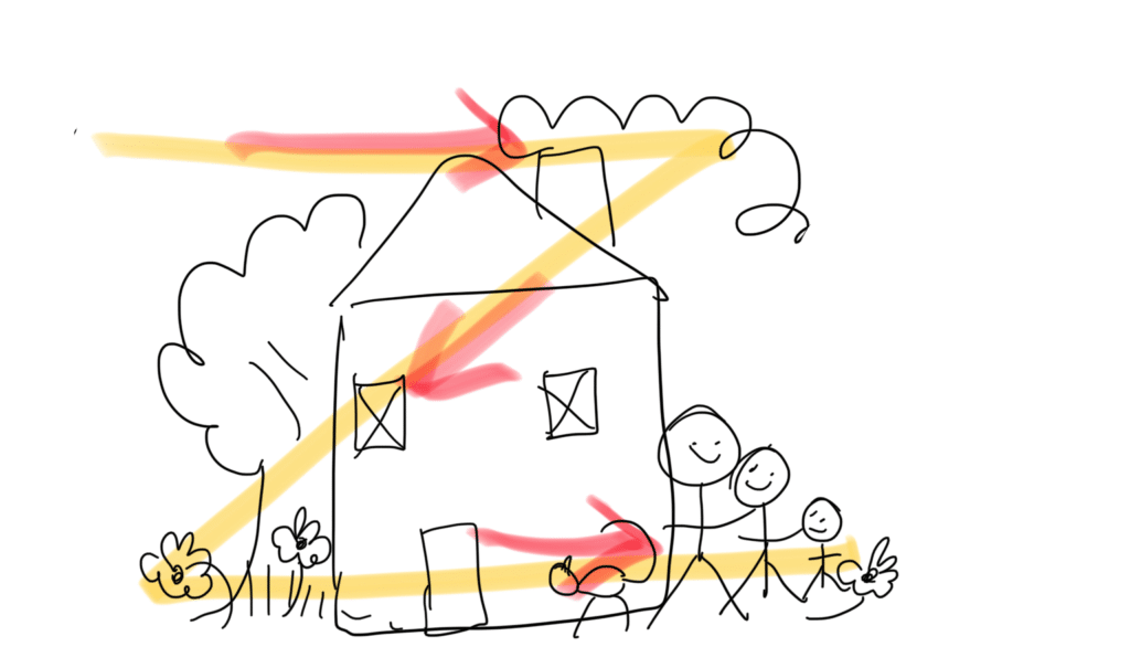
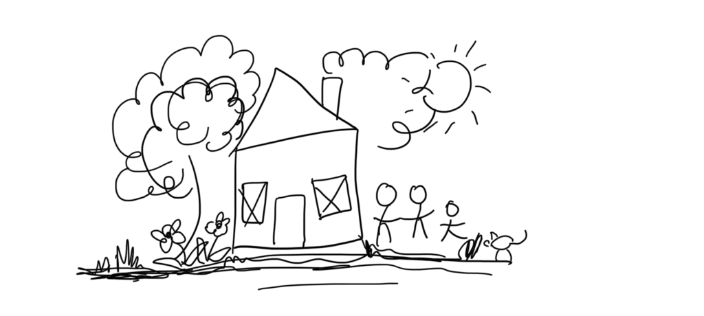
So in the diagram above, we start with the treetop, move across to the smoke, diagonally trace across to the flowers and then back across to settle on the happy family.
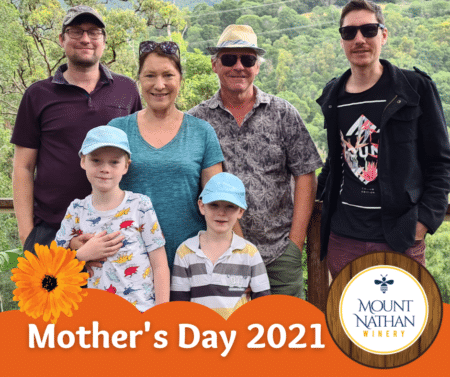
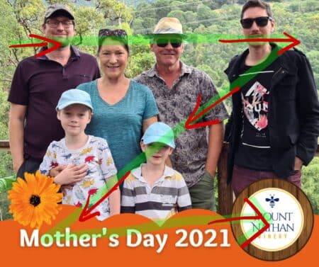
Let’s apply that to this graphic created as a social media post. When you see the Z pattern imposed on the graphic you will see that the client’s logo is the last thing that someone will notice – creating lingering brand awareness.
The people become the focus, then down to the flower and mothers day and then finishing at the client logo (where you want them to be)
The F Pattern
If the diagram, presentation or article is text-heavy, people will often scan a document to find the information they need quickly. With the F pattern, readers begin by scanning left to right across the top (in the same way as the Z Pattern) but then scan quickly down the left side of the page, looking for information that they seek. When they find something that attracts them or is relevant they will then scan from left to right again.
This pattern is repeated until they get to the end of the page.
When you are creating text-heavy documents like landing pages you can trick the eye into stopping and scanning left to right by using a different style or size text (formating).
Consider the F Pattern when creating landing pages, media releases, websites and other text-heavy documents.
Some documents implement both F and Z patterns. For example; if you are creating a poster, you implement the Z pattern for design but place the words or relevant text on the left side for people to scan quickly and find the information they are looking for.
Here’s some samples of how the Z pattern works with a poster
The F Pattern
If the diagram, presentation or article is text-heavy, people will often scan a document to find the information they need quickly. With the F pattern, readers begin by scanning left to right across the top (in the same way as the Z Pattern) but then scan quickly down the left side of the page, looking for information that they seek. When they find something that attracts them or is relevant they will then scan from left to right again.
This pattern is repeated until they get to the end of the page.
When you are creating text-heavy documents like landing pages you can trick the eye into stopping and scanning left to right by using a different style or size text (formating).
Consider the F Pattern when creating landing pages, media releases, websites and other text heavy documents.
Some documents implement both F and Z patterns. For example; if you are creating a poster, you implement the Z pattern for design, but place the words or relevant text on the left side for people to scan quickly and find the information they are looking for.
Here’s some samples of how the Z pattern works with a poster


Connecting elements in design
Before you take a deep dive into a visual hierarchy, as you can understand, the layout of your diagram is important if you want to connect with your prospective customer. Where you put each component determines whether it is seen or not, remembered or not.
Let’s go back to our kindergarten drawings.
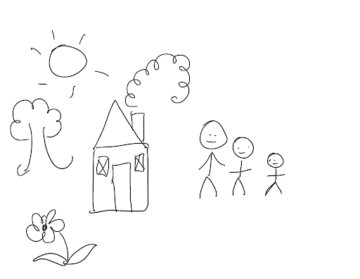
When children draw their family home, their parents and themselves, usually between the ages of around 3-5 years when they are in what is determined to be the pre-schematic phase, objects are line drawings and tend to float in space. As a designer, it’s important to connect and ground those objects. (whether you are drawing or adding elements to your design!)
Here we take a look at a pre-schematic phase drawing. Notice that all the items are floating on the page?
Now when we connect the objects, we can create a more connected design that gives a more pleasing outcome that allows us to view the design as a whole.
It’s important to connect all the elements of your design and you can do that by grouping the elements to create a one-ness or equilibrium of design. By connecting the elements we get a more interesting outcome and you can decide where the most important aspects are placed using the Z or F pattern.
Happy designing.
Cheryl Jowitt is co-founder of Rebel Connect PL, a family owned and operated Australian business that provides total marketing solutions. Rebel Connect clients have access to advertising across the company’s radio networks, Rebel FM & the Breeze and Rebel Agency, a digital marketing solutions company providing website development, SEM and social media marketing strategies.